Vitalink
A health-tech product connecting patients and caregivers through a seamless digital interface.
View on Behance ↗Vitalink connects patients and doctors with ease. Driven by reliability, built to empower.
Vitalink is a forward-thinking platform dedicated to revolutionizing healthcare connections through intuitive, accessible technology. Committed to reliability, empowerment, and care, Vitalink helps patients and doctors connect quickly and confidently. By prioritizing seamless experiences and a culture of trust, Vitalink enables better health journeys, smarter collaboration, and a healthier tomorrow.
Concept:
The Vitalink logo mark is a distinctive fusion of a medical pulse and the initials 'V' and 'L'. The stylized symbol cleverly integrates the steady rhythm of a heartbeat — representing health and connectivity — with the brand's initials, creating a mark that is instantly recognizable and meaningful. This minimalist approach embodies Vitalink's core values of reliability, empowerment, and care, while visually communicating trust and seamless connection at the heart of patient-doctor interaction. Rendered in a simple, professional style, the logo balances modernity with warmth, establishing a clear and approachable brand identity.


a b c d e f g h i j k l m n o p q r s t u v w x y z
0 1 2 3 4 5 6 7 8 9
Inter was selected for its exceptional legibility at small sizes and neutral authority. It reads as trustworthy without being cold — critical in a healthcare context where users are already navigating stress.
- Difficulty finding trusted specialists nearby without word-of-mouth
- Doctor profiles lack credentials, reviews, or wait-time info
- Appointment booking is phone-based — long holds, uncertain availability
- Discover verified doctors quickly with confidence
- Read transparent profiles before committing to a visit
- Book, reschedule, and track appointments entirely in-app
Screens
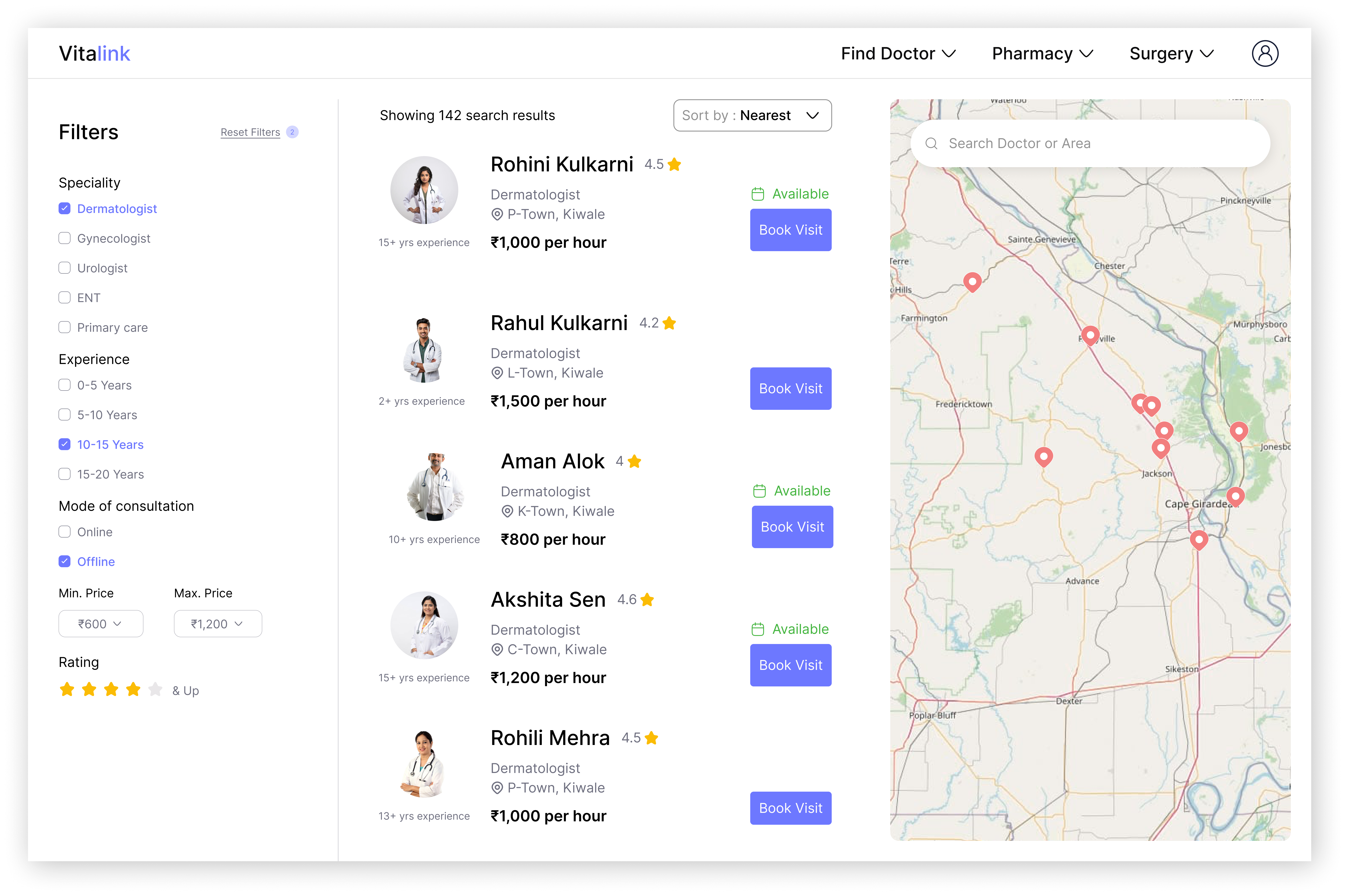
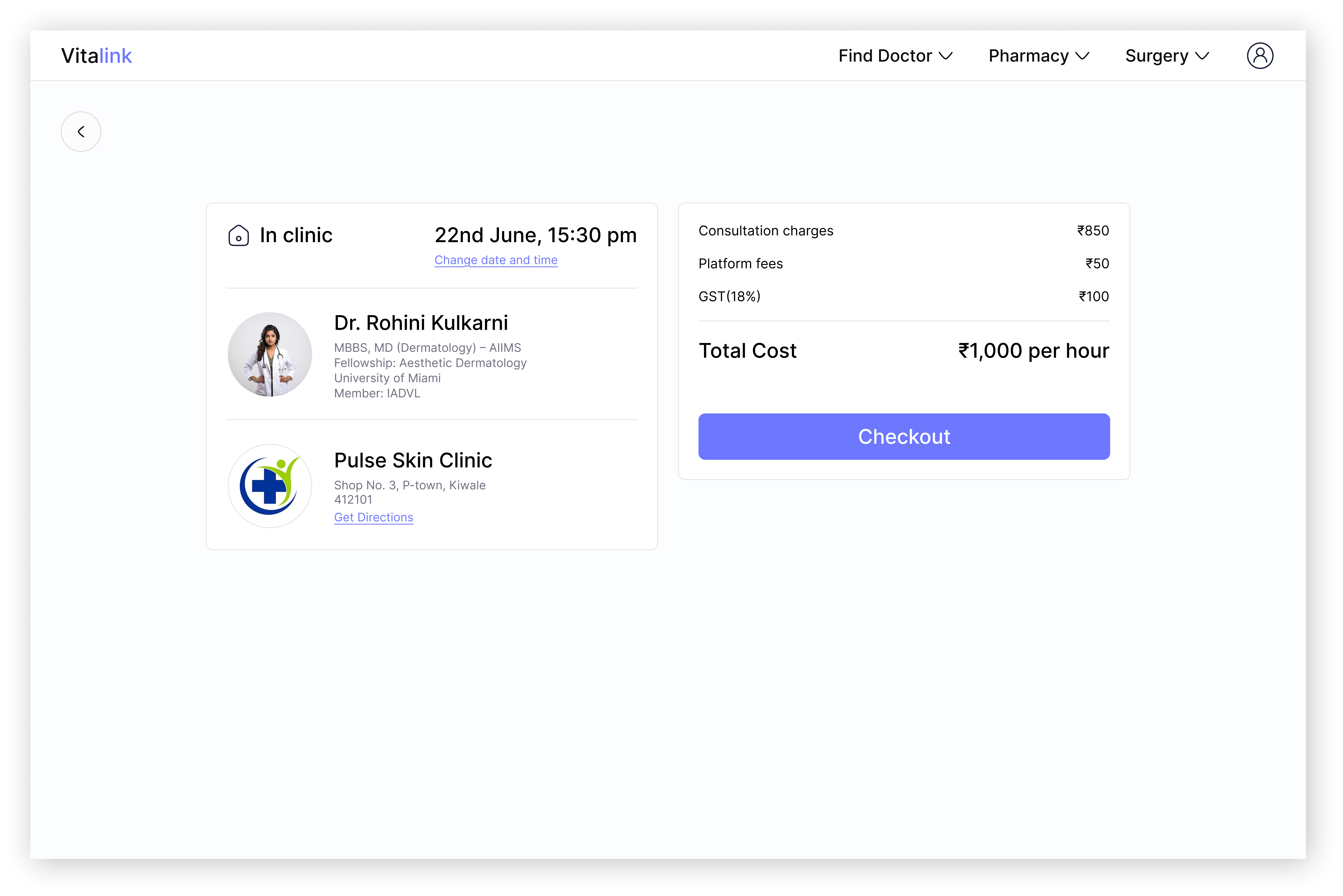
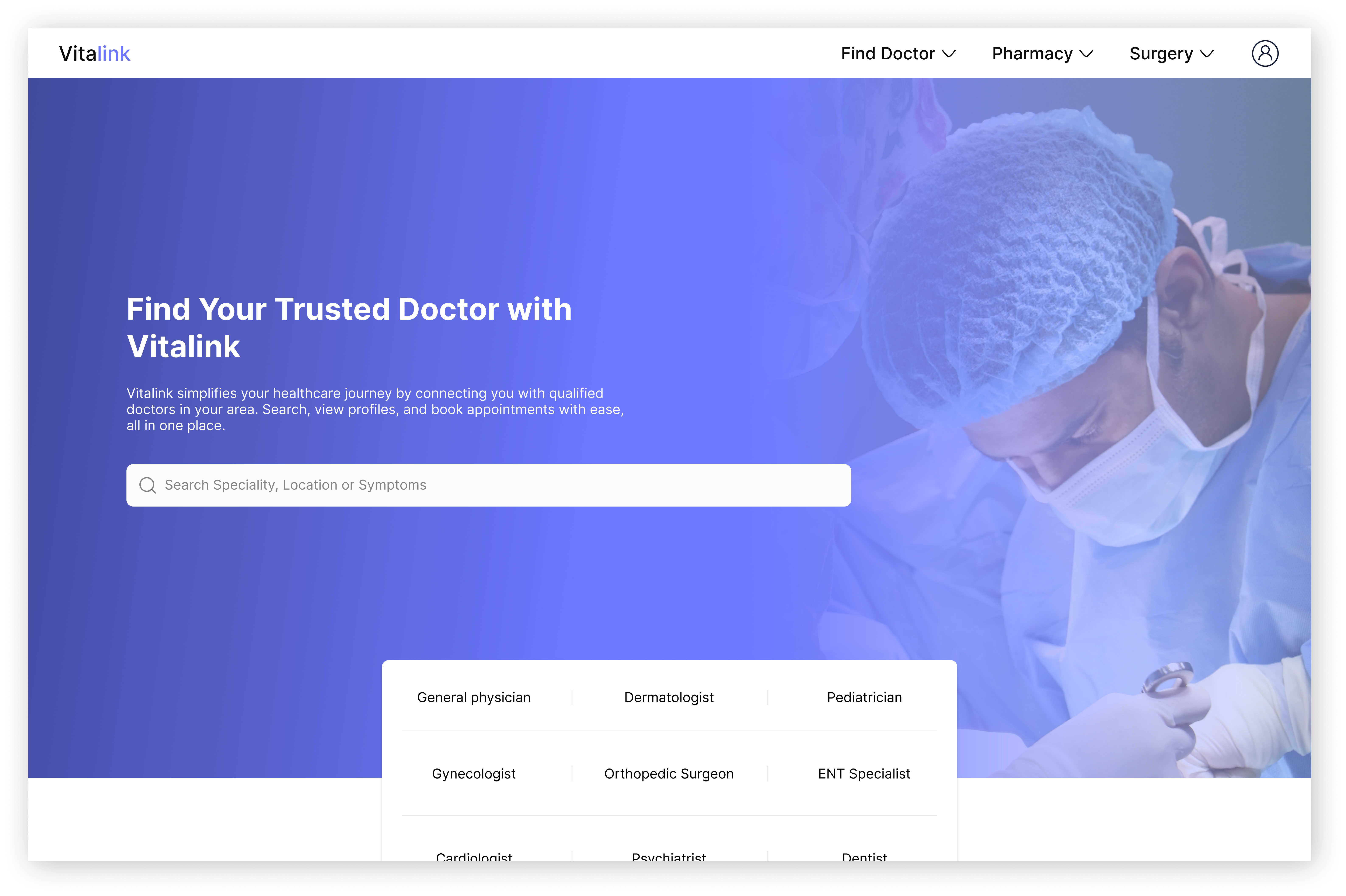
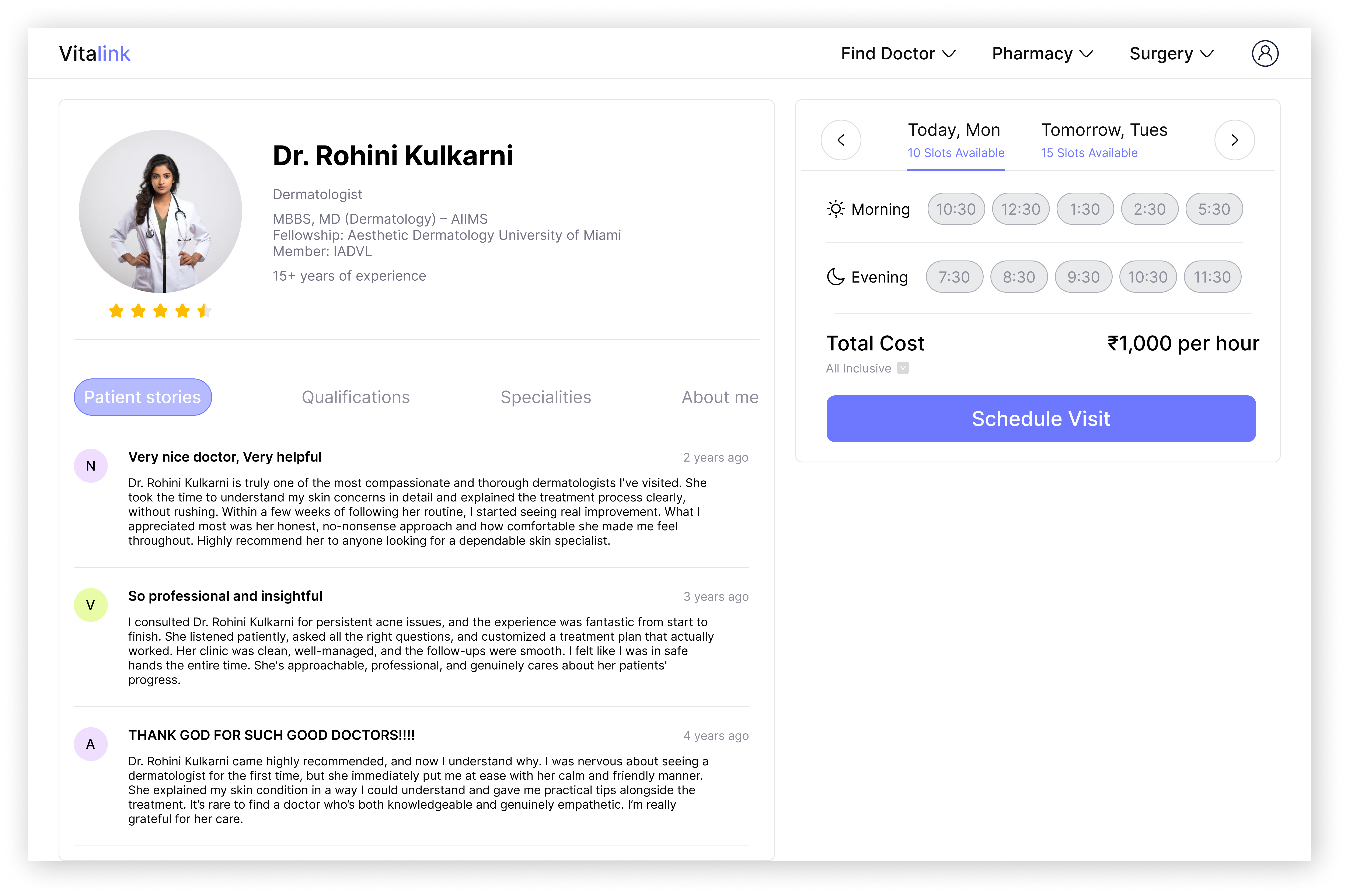
The product flows through four core interactions: discovery (search and filter by specialty and location), browse (a doctor listing with key trust signals surfaced at a glance), profile (deep-dive on a specific doctor with credentials, reviews, and next available slots), and booking (a streamlined 3-step appointment confirmation). Every screen was built to reduce cognitive load — fewer decisions per screen, clearer hierarchy, and instant feedback on actions.